
Role: Lead Product Designer
Results: 97% found the app easy to navigate, with 90%+ validating a clear, intuitive experience.
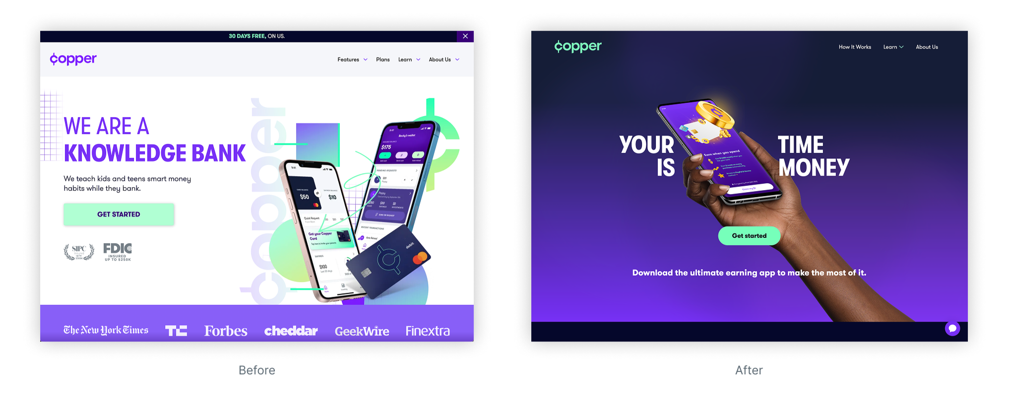
When Copper’s banking middleware provider unexpectedly announced its sunset, the product team faced a critical inflection point. Copper, originally positioned as a comprehensive financial platform, was forced to undergo a dramatic pivot, shifting from a broad suite of banking features to a product singularly focused on helping users earn money.
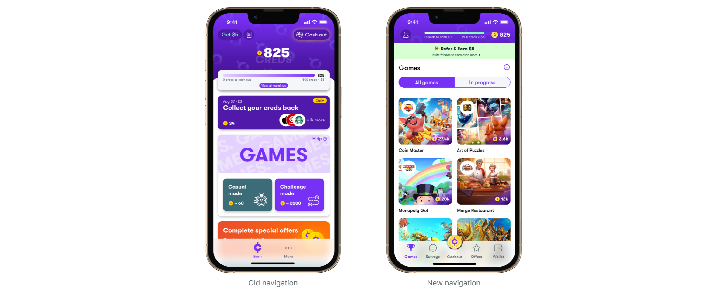
This shift required rapid iteration across multiple surfaces, beginning with reimagining the app’s navigation to align with the new core value proposition. I led the design of this navigation overhaul and partnered across teams to ensure brand consistency and clarity across the entire user experience.
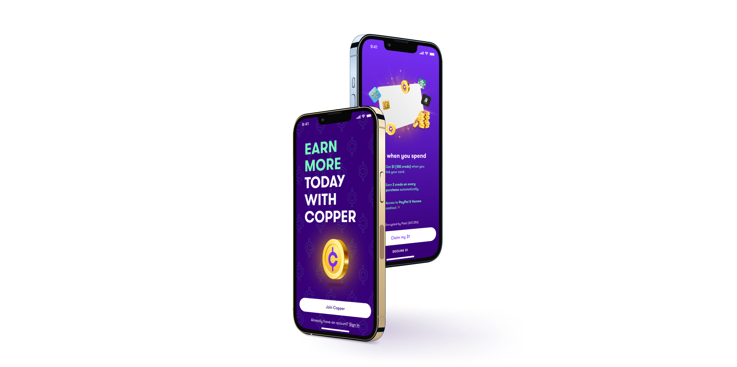
To support the new product direction, I restructured the app’s navigation to elevate visibility of Copper’s earning features. This included:
Segmenting core functionality into distinct navigation tabs to streamline user flows and improve feature discoverability. This structure also enabled deep linking, allowing marketing campaigns to route users directly to relevant in-app destinations based on ad context.
Redesigning the in-app currency’s UI to enhance visual clarity and reinforce the value of earnings through more intuitive hierarchy and typography.
Implementing targeted micro-interactions, such as animated coin bursts on cash-out, to reinforce positive behaviors and increase user engagement.
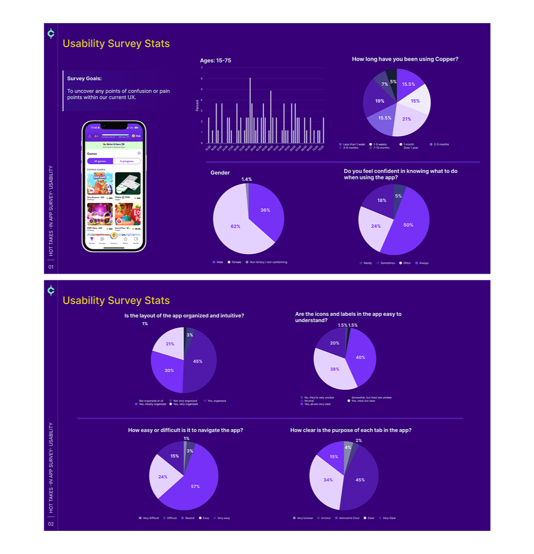
To validate the new navigation structure, I conducted user testing on navigation labels with Copper’s core audience, iterating based on behavioral insights and qualitative feedback. Post-launch, I deployed a follow-up survey to assess clarity, ease of use, and identify any remaining friction points.
Post-launch survey results confirmed the effectiveness of the redesigned navigation.
91% of users found the app layout organized and intuitive
97% said the app was easy or very easy to navigate
93% reported that icons and labels were mostly or fully understandable
94% said they understood the purpose of each tab
These findings reinforced that the design decisions not only aligned with user expectations but also supported a smoother, more confident in-app experience.
In addition to the app redesign, I also led the refresh of Copper’s brand identity and redesigned the marketing website to reflect the company’s new strategic direction. The redesign included:
• Evolving the visual language to align with the new product positioning
• Re-architecting the site to focus on the value of earning
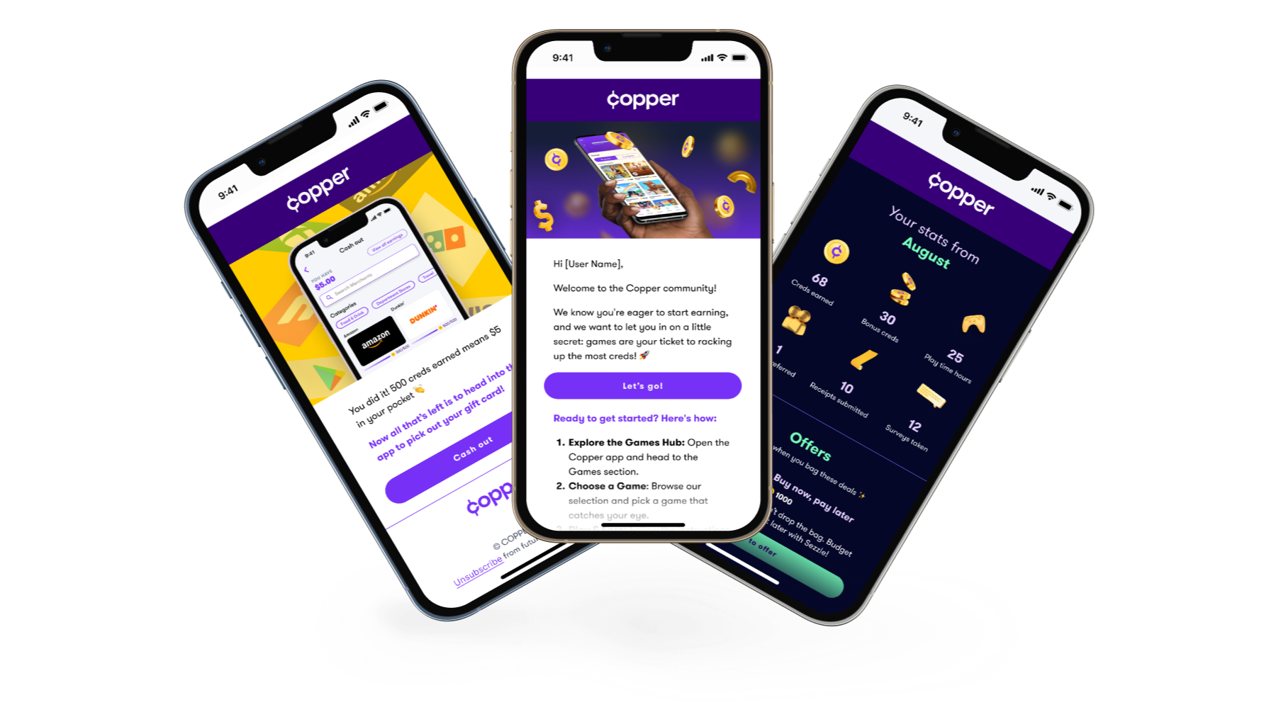
• Designing a new email onboarding and lifecycle journey
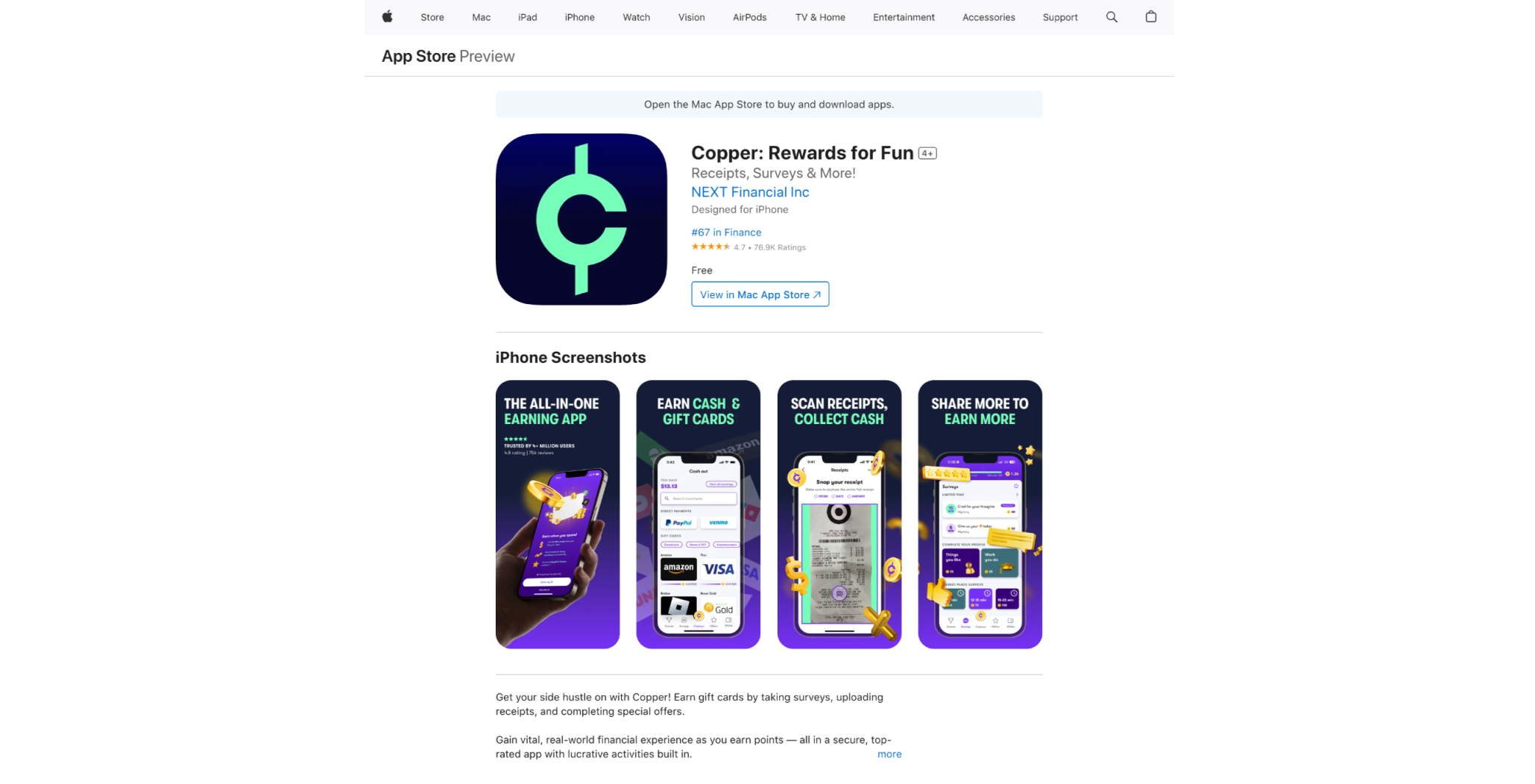
• Redesigning Copper’s App Store presence to ensure visual consistency and clearly communicate the new product focus to prospective users
•
I designed a 14 email lifecycle sequence spanning key user touch points, from onboarding to engagement and reactivation. The campaign achieved an average open rate of 25% and an 8% click-through rate, indicating strong alignment between the updated brand narrative and user expectations.
While it was difficult to see much of the work that earned our team GeekWire’s 2024 UX Design of the Year award sunset, this project taught me how to roll with the punches and stay adaptable in the face of major change.
Navigating an unexpected pivot pushed me to approach uncertainty with curiosity, flexibility, and a user-first mindset. It’s been a wild and rewarding ride learning the ins and outs of the mobile earnings space, and even more fulfilling to help shape a new product that resonates deeply with a growing audience.