


Role: Senior Product Designer
Results: 160,000+ pre-registrations
| 27% weighted conversion rate
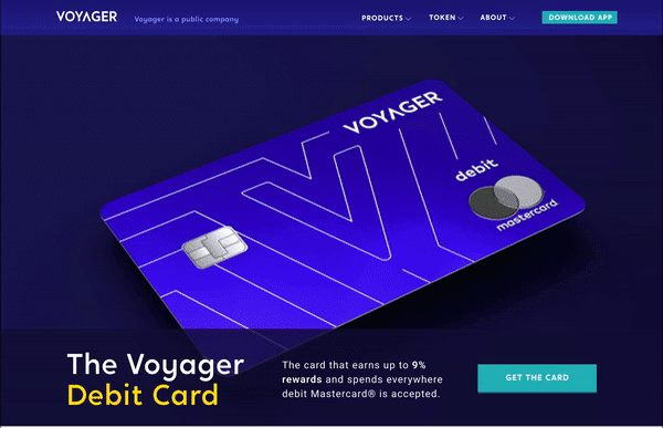
My role at Voyager spanned across both product and marketing. During my time there, I worked on the launch of the Voyager Debit Mastercard®. This project’s goal was to provide an opportunity for Voyager to reach a larger population of potential customers that might not be ready to jump into crypto as an investor or as a trader but would engage with earning interest while having access to spend USDC via a debit card.
Deliverables I was responsible for included the UX/UI across the entire debit card product experience, the marketing landing page, confirmation page, and all email communications.
The vision is to empower users to seamlessly fund their Voyager account directly from USD to USDC, spend USDC with a swipe of their debit card, and earn interest along the way.
Our measurements of success were, increasing account growth directly related to the debit card offering. That was measured by the number of new accounts opened which also applied to the debit card within a 15-day range. An overall increase in friend referrals initiated by the user’s holding debit cards, as well as, an overall increase in engagement within the app.
Internal employees will be the first test group to utilize the cards in the wild and provide feedback. Our second phase will be with a selected beta group of around 3,000 participants, including some of our Loyalty Program members. Full Launch was to follow Beta Testing. Between each phase, we collected information on user experiences, bugs, and identified action items needed before we rolled out to the next group.
Prior to my start at Voyager, product market fit was validated and personas were put together. I put together an in-depth competitive and inspirational deck, so that we could see what others have done and where we could stand out.
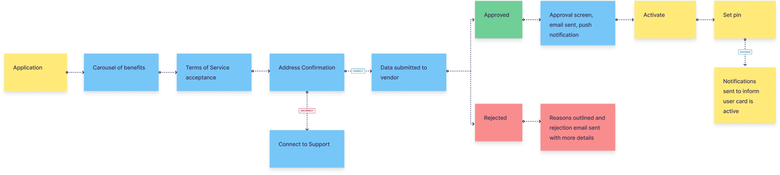
The Voyager mobile app provides a pre-registration experience, allowing users to express interest in the card before the offering is released. Pre-registered users were also our pool for the external beta.
The debit card was positioned to be a big brand moment in the app and I wanted to visually highlight our main value props. After looking at the competition, I wanted to test out listing out all the benefits on one screen VS separate screens.
The carousel was the winner and I knew to ensure even more success I would need to incorporate some eyecatching visuals along with animations.
The first screen within the carousel was designed to make a splash. The line work of the card was utilized to elegantly draw the card into view. The second screen was designed to give the viewer a feeling of increasing rewards. We needed to keep this animation evergreen in case the percentage changed in the future. On the last screen, I gave a nod to the Mastercard logo with the two circles that merged to create the USD Coin. I storyboarded these visuals for the animator that I partnered with, to bring them to life.
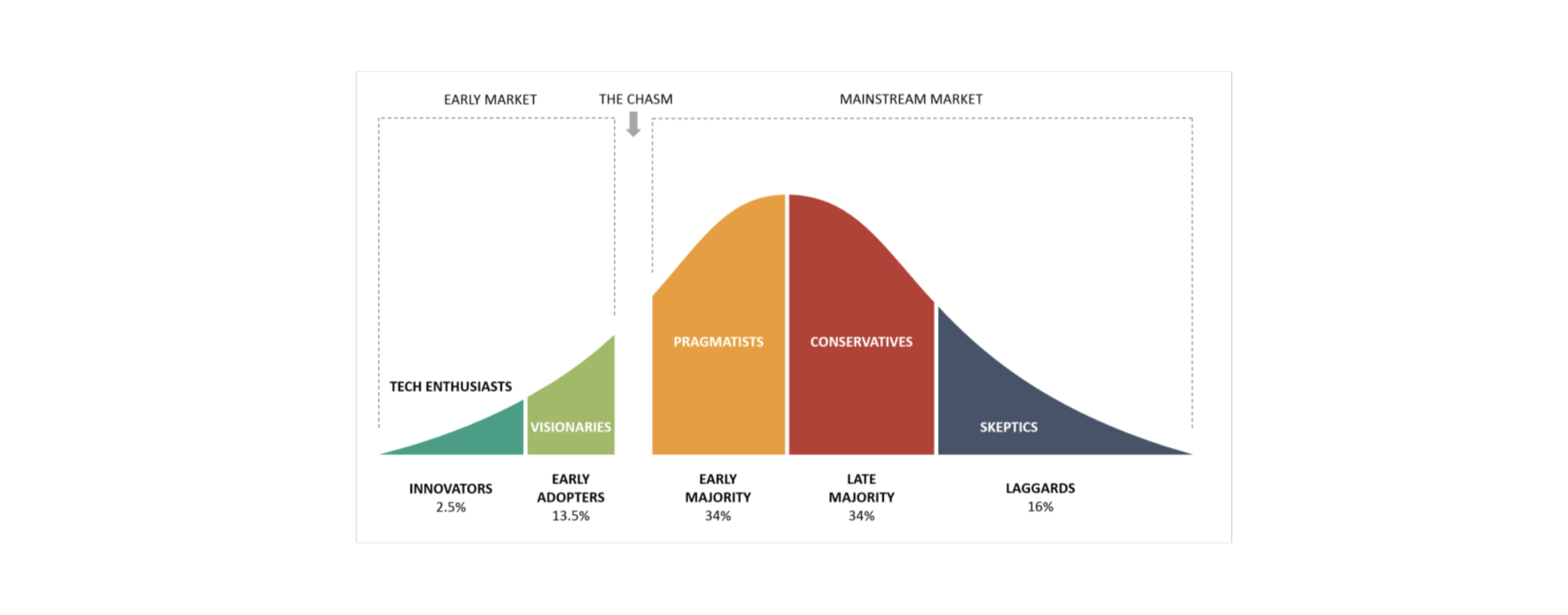
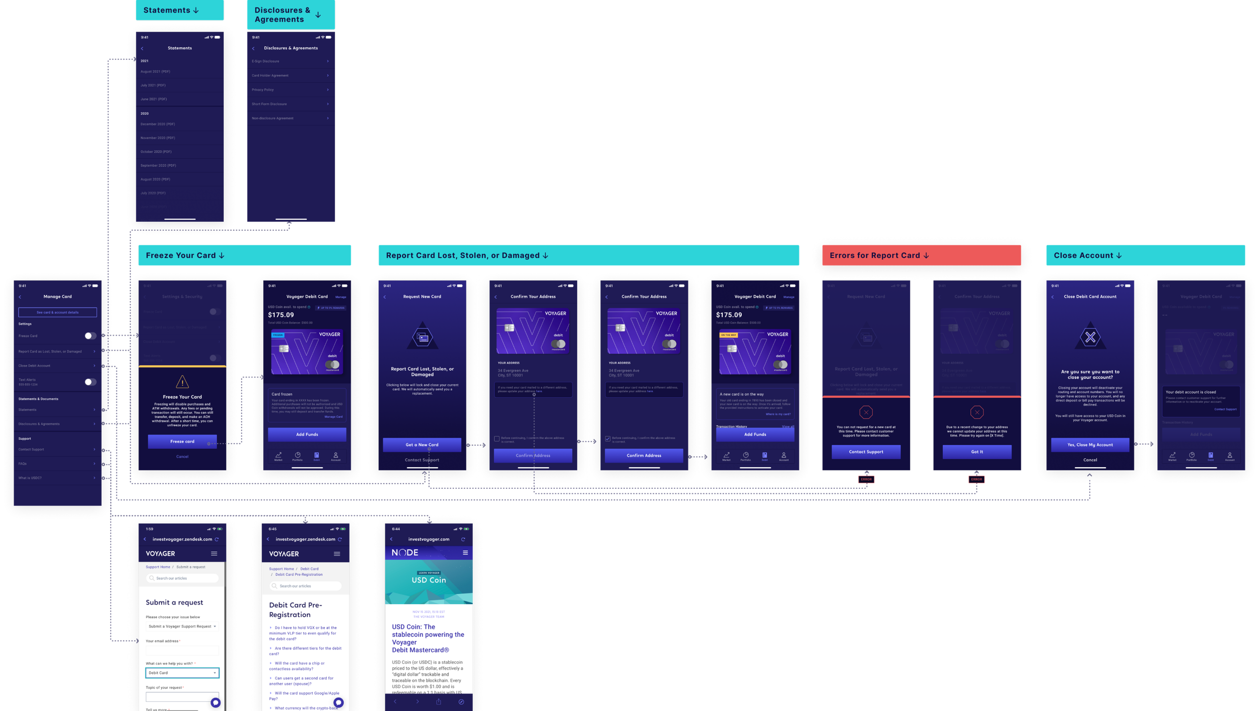
The requirements for the application and activation flows were users being required to accept the terms and conditions to apply, that there will be approval or rejection within 5 seconds of applying, and users will have the ability to activate the card and create a PIN within the app. Some considerations we had were giving users the ability to change their address before submitting their application and post-submission education.
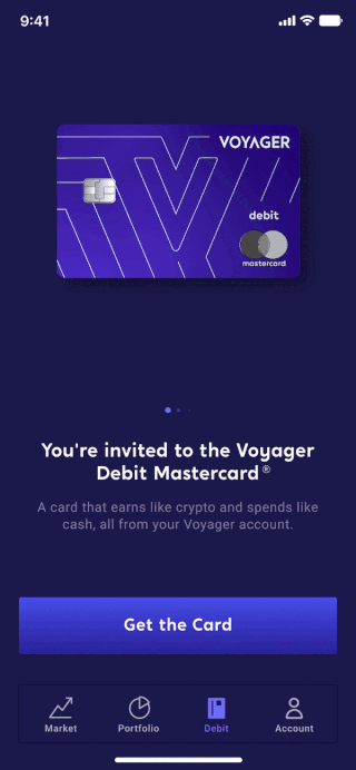
For the manage card section of the app, the requirements were allowing the user to lock and freeze the card. Close their account, have the ability to contact support, request a replacement card, and view statements. At this time we weren’t allowing PIN changes in-app, nor requests for an increase of card limits or disputing transactions. The main consideration was that this section should accommodate a growing list of self-service features.
I utilized existing design patterns and skipped over the wireframe stage for this feature. I had 2 designs that I wanted to test. Option A splits the sections into their own pages while Opt B keeps each section on the screen. Since there’s sensitive information I split out the card and account details and had hidden behind a tap.
I ran a balanced comparison preference test between the two designs to see which experience users preferred. Opt B was the winner.
For the design of the landing page, I focused on highlighting the card design and utilizing micro animations throughout the page to not only catch our audience’s eye but also educate them on our offering. I collaborated with our staff animator to create the animation at the top of the page. This page became one of the first 5 pages visited on the site after launch and the average time spent on the page has surpassed all other web pages.
This landing page alone lead to approximately 17K sign-ups.
I designed 16 emails in total, with 4 unique emails per user type. The average open rate was 45% and the average click rate was 15%.
We had a weighted conversion rate of 27% across both the app and landing page. Three months after we launch our Beta experience, I sent out a user survey to gain insight into the overall experience and possible improvements. The overall rating was 4.7/5 and we had a Net Promoter Score of 87.
This project was a huge undertaking and I learned a lot while working on it. I learned how to communicate with our banking partners and that banks move a lot slower than startups. It would typically take 7-10 days to get approvals. When working with outside vendors, it’s very important to understand their timelines and how that can impact you and your work.